What Color is Chartreuse and what is its meanings and associations, plus what is the origins of the color, how does it influence us and what does it suggest about your personality if it’s a favorite color?
What Color is Chartreuse?

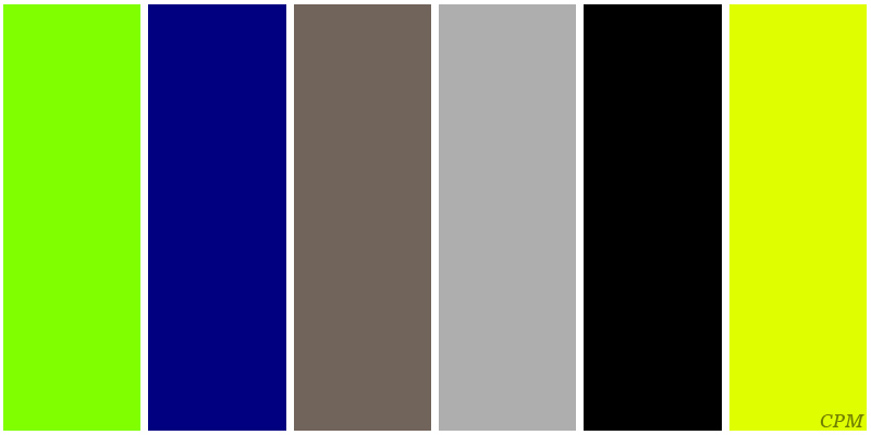
The color chartreuse is somewhere between green and yellow. There is chartreuse Green, also known as (Web Chartreuse) and chartreuse Yellow, also known as (Traditional Chartreuse). Simply increase the dominance of the colors green and yellow to get the desired version of the color. Chartreuse green is also sometimes known as lime green or apple green. Chartreuse yellow is also known as mellow yellow.
Origins
The word Chartreuse is French in origin, which means Charterhouse, which is the name given to the Carthusian Monasteries. It’s within these monasteries where the monks produced Chartreuse liqueur.
Chartreuse green and yellow get their names due to their similarity in color to those French liqueurs; green chartreuse was released in 1764, and yellow chartreuse was released in 1838.
Where is Chartreuse Used?
The color Chartreuse is sometimes used in home decoration, but it’s fairly rare. It’s more often used in sportswear, similar to how highly visible and high energy colors such as orange and yellow are used. Chartreuse Yellow is often considered the color of high visibility safety clothing, and also the most common color of tennis balls.
Color Chartreuse Personality
Both versions of chartreuse are attractive yet unconventional colors. To wear or display either color in large amounts shows inward, unconventional thinking. You’re probably intuitive, with a strong need for self-expression and uniqueness, and, more than likely, a strong motivation to be creative in some way.
Choosing chartreuse in some form probably suggests a person with an open personality. Open-minded, imaginative with many interests. Variety in work and life is very important.
Both colors can look great when combined with other colors, especially darker colors. This would suggest a strong interest in appearances. Visual simulation is important with a great deal of mental energy going into either how they look, or the environment within they live.
Colors that combine well with Chartreuse
Some of the colors that go well with chartreuse are black and dark blue shades. Gray and white also combine well, particularly in interior design.
Influences – The color chartreuse can increase physical and mental/social energy and enthusiasm. It can encourage us to go outside and enjoy nature and wildlife. Chartreuse can also increase positive thinking and optimism. Because chartreuse is made up of yellow and green, two colors which are strongly associated with envy/jealousy and ill health, the same association can be made with chartreuse.

