Color terminology is more complicated, confusing and varied than it would at first seem. This article is a guide to a basic understanding of color terminology. Hue, shade, tint and tone, what do all these actually mean?

Understanding Color Terminology
Color Theory – Color theory is the science and developments in the understanding of colors. It includes how colors come to be, how they mix and react with each other. The color wheel is a big part of color theory, see primary, secondary and tertiary colors for more on this. It can also branch out into the influences and psychology of colors.
Hue – Hue is a term given to a particular color family found on the color wheel. So pure blue, dark blue and light blue are all part of the same hue or family.
Tone – A color tone is created as a result of adding gray. This can be used for the purpose of softening a color to some degree.
Mass Tones – Mass tones are the main pure colors at the root of any tint or shade. If you take a light red pinkish tint like raspberry, its mass tone is red.
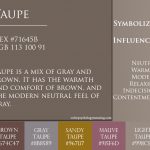
Earth Tones – Earth tones are simply colors that can be found in nature, or occur naturally. For example the color of soil, sand and clay, all tints and shades of brown including tan and taupe are considered earth colors. It can also include greens and blues, such as grass, leaves and the sky.
Pure – A pure color in theory is an unaltered, unmodified and the strongest example of a particular color. A pure color is not mixed with any other color, including white or black.
Tint – Tint is what you call a lighter variation of a color. Add white to a pure color and you create a tint variation.
Shade – A color shade is a darker variation of a pure color. Shades are created by adding a degree of black.

Color Scheme – This is an grouping of colors, to be used for a particular purpose. A retailer may use a repeated color scheme or two or more colors for their shops. Color scheme is also known as a color palette, or a color plan.
Wavelength – The light that we see is in wavelengths, measured in nanometers (nm), ranging from 400 – 700 (nm). Different wavelengths produce different colors, 450nm Blue, 550nm Green, 700nm Red.
Additive – Additive colors are the RGB colors of light. White is created by adding the three primary colors.
Subtractive – Subtractive colors as seen in the RYB and CMY models, used in paint and ink printing. White is the absence of color, assuming the target for the paint or ink is white (paper), and black is created by mixing all colors.
Analogous – Analogous colors are colors that are next to each other on the color wheel. They are colors that blend naturally, which can be seen in nature, for example, green, green yellow and yellow.
Clashes – Color clashes occur when colors are similar in strength or intensity, that results in a combination that is difficult or unpleasant to look at. If this happens with a background and text, the text would be difficult to read. This could also be called a bad contrast of colors.
Complimentary – Complimentary color are colors that sit on either side of the color wheel (opposite ends), for example blue and orange. Complimentary colors are called that because they do compliment each other, strengthening and amplifying each color. Complimentary colors are always a mix of one warm and one cool color.
Intensity/Saturation – Color intensity is the strength or brightness of a particular color. A color that is high intensity doesn’t have to be a bright color, but rather pure, or described as strong. To reduce a colors intensity or saturation, you would add gray to the color.
Complex – Complex colors include third level colors on the color wheel. Complex colors also includes all sorts of subtleties and variations which goes beyond the common tertiary or third level colors.
Intermediate – Intermediate colors are created when a primary color is mixed with the nearest secondary color. So an example would be, blue primary and green secondary equals (blue green). Intermediate colors are also known as tertiary colors.
Monochromatic – Monochromatic colors is a palette or scheme that derives from one main color or hue. So a monochromatic color scheme based on green would include various tints and shades of green.
Color Harmony – Harmonious colors are color combinations that simply work well with each other. They can be created from analogues or complementary colors.


